# BiocManager::install("DESeq2", force = TRUE) # run once if not installed
library(DESeq2) # core DGE analysis
library(tidyverse) # data wrangling & ggplot2
library(pheatmap) # heatmap plottingRNA-seq and Transcriptomics: Approaches, Workflow, and Downstream Analysis
UCD Bioinformatics Course 2026 — Workshop Companion
0.1 Introduction: What Is RNA-seq?
RNA sequencing (RNA-seq) is a high-throughput, next-generation sequencing (NGS) technology used to analyze the entire transcriptome — every RNA molecule — in a cell or group of cells at a specific moment in time. The basic recipe is always the same: isolate RNA, convert it to complementary DNA (cDNA), and sequence it. What comes out the other end lets you identify, quantify, and analyze gene expression across whatever samples you’re comparing.
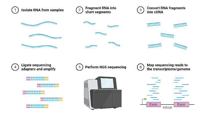
That single technology, though, can be pointed at very different questions depending on how you set up the experiment. This document walks through the one of the major flavors of RNA-seq experiment: bulk RNA-seq (vs. single-cell, and spatial trancriptomics),the bioinformatics workflow that turns raw sequencing reads into a usable count matrix, the statistics and R script behind differential expression analysis, and how those counts can be extended into gene co-expression networks.
0.2 Three Ways to Ask Transcriptomic Questions
Bulk RNA-seq is the workhorse approach: RNA is extracted from a tissue or a population of cells all at once, so the resulting measurements are an average across every cell in the sample. It’s the right tool when the questions are about groups rather than individual cells:
- How many and which genes are differentially expressed — up- or down-regulated between conditions?
- What are the absolute expression levels — which genes are effectively “on” versus “off”?
- What biological pathways are affected (the functional interpretation of those expression changes)?
- How do samples compare — disease versus healthy, treated versus control, and so on?
- Can outcomes be predicted from expression patterns (biomarkers, classification)?
The catch is exactly what makes it efficient: because it averages across every cell in the sample, it can hide important structure. A tumor sample, for instance, contains cancer cells, immune cells, stromal cells, and endothelial cells all mixed together, and a bulk measurement blends all of them into one number per gene. A study comparing peripheral blood mononuclear cells (PBMCs) from dogs with different mammary tumor types illustrates this directly: cells from tumor-impaired animals showed a large number of down-regulated genes relative to normal and normal-like samples — a population-level signal that bulk sequencing is well suited to detect.
Single-cell RNA-seq is a higher-resolution technology that measures gene expression in individual cells rather than averaging across a bulk sample. By isolating individual cells and sequencing their unique mRNA, researchers can identify distinct cell types, reveal heterogeneity that would otherwise be invisible, and track disease progression or developmental change cell by cell. Where bulk RNA-seq answers questions about groups, scRNA-seq answers questions about composition and identity:
- What cell types are present (cell identity and clustering)?
- What is the developmental trajectory — how do cell states transition over something like pseudotime?
- Which genes distinguish one cell type from another (marker genes per cluster)?
- What does the cell-cell interaction network look like (ligand-receptor pairs)?
- How heterogeneous is expression from cell to cell?
- Are there rare cell populations that a bulk measurement would have averaged away entirely?
A useful real-world illustration comes from work characterizing circulating leukocytes in dogs: unsupervised clustering of tens of thousands of cells revealed 42 distinct immune cell populations in healthy animals. Extending that same approach to dogs with osteosarcoma showed that myeloid cells contributed to most of the transcriptomic changes between healthy and cancer samples, while double-negative T cells and B cells shifted in relative abundance — the kind of population-specific detail that a bulk measurement of the same tissue would have blurred into a single averaged signal.
Spatial transcriptomics is a molecular profiling method that maps gene expression directly within intact tissue samples, preserving the physical location of each cell. By combining imaging with next-generation sequencing, it reveals not just which genes are active, but where in the tissue they are active — crucial context for understanding cellular interactions and structures like the tumor microenvironment. Its natural questions are inherently spatial:
- Where in a tissue (in two or three dimensions) are particular genes expressed?
- What is the spatial organization of different cell types — the tissue’s architecture?
- How do neighboring cells interact, based on their physical proximity?
- What disease-associated spatial patterns exist — lesions, infiltration, zonation?
- How does expression vary by tissue region (microdomain biology)?
- What is the tissue’s structural or layer composition, combining histological context with transcriptomic data?
Tumor biology is a natural fit for this approach: spatial transcriptomics can reveal intratumoral subpopulations and spatial clustering patterns tied to gene expression across primary, metastatic, and recurrent tumors, letting researchers investigate intratumoral complexity and the surrounding tumor environment in ways that neither bulk nor single-cell sequencing can, since both of those methods discard spatial position during sample processing.
0.2.1 Comparing the three approaches
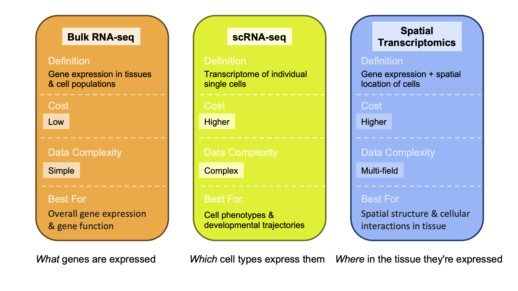
In one line: bulk RNA-seq tells you what genes are expressed, single-cell RNA-seq tells you which cell types express them, and spatial transcriptomics tells you where in the tissue they’re expressed.
0.3 Bioinformatics in Bulk RNA-seq
0.3.1 The workflow at a glance
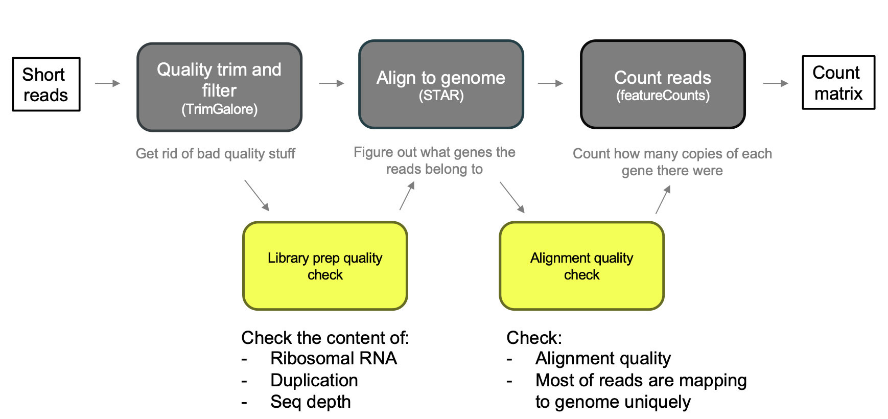
Once you’ve decided bulk RNA-seq is the right approach and sequencing is done, the raw output is a pile of short reads that need to be turned into something biologically meaningful. The standard workflow has three main stages, run in order:
- Quality trim and filter (commonly with a tool like TrimGalore) — get rid of bad-quality stuff before it contaminates everything downstream.
- Align to the genome (commonly with STAR) — figure out what gene each read belongs to.
- Count reads (commonly with featureCounts) — count how many copies of each gene’s transcript were present, producing a count matrix.
NoteVocabulary
A few pieces of vocabulary are worth pinning down before going further. A read is the basic unit of sequencing output: a fragment of sequence that has actually been sequenced. Depth (or coverage) is the average number of reads that map to a given region of the genome or transcriptome — higher depth means greater sensitivity for detecting lowly expressed genes. The count matrix that comes out at the end has genes as rows and samples as columns, where each number is how many reads mapped to that gene in that sample.
NoteTwo caveats
First, raw counts are not directly comparable between samples — different samples can have different total sequencing depth, so counts need to be normalized before they can be compared meaningfully (more on this below). Second, and more fundamentally: a bad experimental design cannot be fixed computationally. Replication, randomization, and controlling for batch effects all have to happen before sequencing — no amount of downstream statistical cleverness recovers an experiment that wasn’t designed properly in the first place.
0.3.2 Alignment with STAR
DNA aligners generally fail on RNA-seq data, because RNA reads span introns — a read can start in one exon and continue in another, with the intervening intron spliced out. Detecting those exon-exon junctions requires an aligner built for the job. STAR (Spliced Transcripts Alignment to a Reference) is the standard tool: it’s splicing-aware, handling spliced reads directly, and it’s fast and accurate compared with older, unspliced aligners.
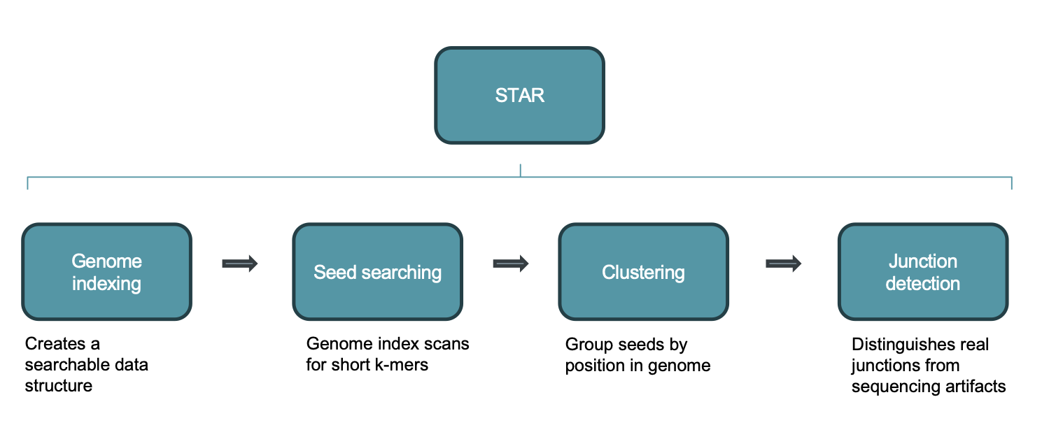
STAR’s alignment process breaks down into four stages:
- Genome indexing — STAR creates a searchable data structure from the reference genome ahead of time, so it doesn’t have to scan the raw genome sequence for every read.
- Seed searching — for every read, STAR searches for the longest sequence that exactly matches one or more locations in the reference genome. These longest exact matches are called Maximal Mappable Prefixes (MMPs), and each one is called a “seed” (the first is seed1). STAR then searches again, but only against the unmapped portion of the read, to find the next MMP (seed2), and so on. This sequential searching of only the leftover, unmapped portion of the read — rather than repeatedly searching the whole read — is what makes STAR’s algorithm efficient. It relies on an uncompressed suffix array to search quickly even against very large reference genomes, in contrast to slower aligners that search the entire read before splitting and iterating.
- Clustering — the separate seeds from a single read are stitched back together into one complete alignment. STAR first clusters seeds by proximity to a set of “anchor” seeds (seeds that don’t map to multiple locations), then stitches them together based on the best-scoring alignment for the read, with scoring based on mismatches, indels, gaps, and similar penalties.
- Junction detection — STAR distinguishes genuine splice junctions from sequencing artifacts, which is what allows it to correctly place reads that span an exon-exon boundary rather than an intron.
0.3.3 Quality checks along the way
Quality control happens at two points in the workflow: a library-prep quality check (on the raw and trimmed reads) and an alignment quality check (once reads have been mapped). At the alignment stage, the two things to watch are whether alignment quality is generally good — that is, whether most reads are mapping to the genome uniquely — and the content of the reads themselves: ribosomal RNA contamination, duplication levels, and sequencing depth.
Trimming red flags. Not all reads coming off the sequencer are trustworthy, and a few patterns are worth specifically watching for after trimming. Very short reads that remain after trimming are uninformative. Adapter sequences — synthetic sequences added during library preparation — are not biological signal and shouldn’t be mistaken for it. Low-quality bases tend to accumulate at the ends of reads simply because the sequencing chemistry degrades over the course of a run. Keeping low-quality reads introduces errors downstream: a misread base can cause a read to map to the wrong gene, or fail to map at all, which corrupts the count matrix everything else depends on.
More specifically, a few thresholds are useful rules of thumb:
WarningTrimming red flags
- High adapter content (more than roughly 10–15% of reads) suggests library prep issues or very short insert sizes. A little adapter contamination is normal; a lot means something went wrong during library construction.
- Very high duplication rates (above roughly 50–60%) mean many reads are identical copies of the same original molecule, usually from over-amplification during PCR. In extreme cases this means you’ve effectively resequenced the same few molecules over and over and have little real coverage.
- Poor per-base sequence quality at read ends is expected and fixable by trimming — but if quality drops early (in the first 20–30 bases) rather than just at the tail, that can indicate a problem with the sequencing run itself, not just normal chemistry decay.
- Overrepresented sequences that aren’t adapters could indicate rRNA contamination (very common if mRNA enrichment failed), primers, or other contaminants. rRNA reads are uninformative for gene expression and simply inflate your total read count without adding any gene-level data.
- Reads trimmed down to very short lengths (under roughly 20–25 bp) suggest the original insert was tiny to begin with — a library prep problem that trimming cannot fix after the fact.
- Low percentage of reads surviving trimming (below roughly 70–75%) means a large fraction of the data was unusable before the analysis even began.
Alignment red flags. Once reads are aligned, the single most important metric is the overall mapping rate: reads that don’t map anywhere are invisible to every downstream analysis. As a real example, a set of samples from a time-course experiment (D0, D7, and D14, three replicates each) mapped at rates in the low-to-mid 80% range:
WarningAlignment red flags
- A low overall mapping rate (below roughly 70–75%) commonly points to one of a few causes: the wrong reference genome or annotation, heavy rRNA or adapter contamination, RNA degradation, or sequencing a strain that’s genomically divergent from the reference.
- A very high multimapping rate — reads that map equally well to many genomic locations — usually reflects repetitive elements or paralogous gene families (that is, a substantial number of reads mapping to somewhere between one and ten loci, versus reads mapping to ten or more loci and being effectively unresolvable).
- Uneven coverage across a gene body is another red flag: a 3’ bias (reads piling up toward the 3’ end of transcripts) suggests RNA degradation, since RNA degrades from the 5’ end first and leaves the 3’ end better represented; a 5’ bias instead points to a problem in library prep chemistry. Either pattern is worth investigating by looking at individual genes in a genome browser like IGV.
- A strand-specificity mismatch — where the alignment parameters don’t match how the library was actually prepared (stranded versus unstranded) — causes reads to be assigned to the wrong gene or discarded outright, so it’s worth confirming the library’s strandedness with whoever ran the sequencing before choosing alignment parameters.
- Inconsistent mapping rates across samples are a problem in their own right: if one sample maps at 90% and another at 40%, the two are not comparable, and the low-quality sample may need to be excluded — which in turn affects statistical power and the overall experimental design.
0.3.4 From aligned reads to a count matrix
The final step of the core workflow — counting reads per gene, commonly with featureCounts — produces the raw counts table that everything downstream is built on: genes as rows, samples as columns, and each cell holding the number of reads that mapped to that gene in that sample. This raw counts table is the deliverable of the entire upstream pipeline, and it’s the starting point for differential expression analysis.
0.4 Differential Expression Analysis
0.4.1 Why counts need their own statistics
Differential expression means a gene is expressed at a higher (or lower) level in one condition compared with another, consistently across replicates. Answering that question rigorously requires the right statistical model for count data, and RNA-seq counts have a distinctive shape: they are not normally distributed, and they are over-dispersed — meaning the variance is greater than the mean:
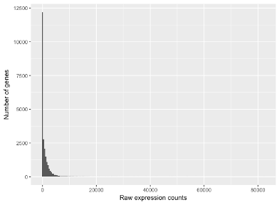
Most genes have low counts,a handful of genes (housekeeping genes, ribosomal genes) have very highcounts, and counts are bounded at zero, since you can’t have a negative number of reads. That zero boundary forces any spread in the data to go rightward.
A Poisson distribution — a natural first guess for count data — has only one parameter (λ), which forces variance to equal the mean. Because RNA-seq counts are over-dispersed, a Poisson model systematically underestimates the real spread in the data, which makes test statistics look more significant than they really are and inflates false positives. A normal (Gaussian) distribution doesn’t fit either, because counts are discrete, bounded at zero, and right-skewed, especially for lowly expressed genes — a continuous, symmetric distribution is a poor match.
The distribution that does fit is the negative binomial: a discrete distribution bounded at zero, with a long right tail and a dispersion parameter (α) that lets variance grow faster than the mean. Mathematically, variance is modeled as σ² = μ + αμ², and when α approaches zero the negative binomial collapses back into a Poisson distribution — so Poisson is really just a special case of it. Biologically, this can be thought of as a Poisson process (capturing the technical counting noise from sequencing) where the underlying rate λ itself varies across samples according to a Gamma distribution (capturing real biological variability between samples, such as sample-to-sample stochasticity in transcription).
Two more concepts round out the statistical picture. First, RNA-seq differential expression testing is inherently a multiple testing problem — a typical analysis tests around 20,000 genes simultaneously, and at a naive significance threshold of p < 0.05 that means roughly 1,000 false positives by chance alone. This is why results are reported using false-discovery-rate (FDR) correction and an adjusted p-value rather than the raw p-value. Second, effect sizes are reported as log2 fold change: using log base 2 means a doubling of expression is a clean +1, and a halving is a clean −1, which makes the scale symmetric and easy to interpret in either direction.
0.4.2 DESeq2: from counts to a results table
DESeq2 is a widely used tool for differential expression that estimates variance across genes, shrinks noisy per-gene estimates toward a common trend, and then tests each gene individually. Starting from the raw count matrix, it works in three steps:
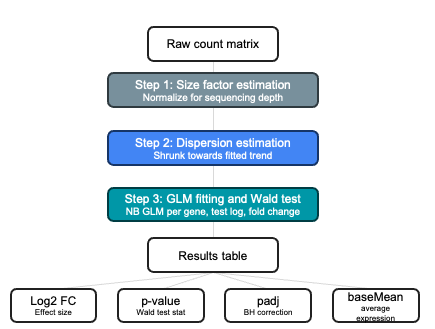
- Size factor estimation — normalizes each sample for differences in sequencing depth, so counts become comparable across samples.
- Dispersion estimation — estimates each gene’s dispersion and shrinks noisy per-gene estimates toward a fitted trend line, borrowing statistical strength across genes.
- GLM fitting and Wald test — fits a negative-binomial generalized linear model per gene and tests the log fold change using a Wald test.
The output is a results table with one row per gene and a standard set of columns: baseMean (the average expression level for that gene across samples), log2FoldChange (the effect size), the Wald test statistic and its raw p-value, and padj (the p-value after Benjamini-Hochberg, or BH, correction for multiple testing).
0.4.2.1 Specifying the model
Crucially, the statistical model DESeq2 fits is driven directly by the experimental design formula you give it. A simple one-condition, two-group comparison (say, treated versus untreated) looks like this, with the specific contrast of interest specified explicitly afterward:
dds <- DESeqDataSetFromMatrix(countData = counts,
    colData = metadata,
    design = ~ condition)

# then specify the contrast you want explicitly:
results(dds, contrast = c("condition", "day7", "day0"))
If there’s a batch effect to control for, the design formula simply adds it as another term, so that batch is controlled for while condition is the factor actually being tested:
dds <- DESeqDataSetFromMatrix(countData = counts,
    colData = metadata,
    design = ~ batch + condition)
And if the question is whether a treatment effect depends on genotype — an interaction effect — the design formula multiplies the two terms together:
dds <- DESeqDataSetFromMatrix(countData = counts,
    colData = metadata,
    design = ~ genotype * treatment)
1 Practical example
1.0.1 Example dataset: a time-course dataset
For this training we will use a dataset with nine samples: three time points (day 0, day 7, and day 14), three biological replicates per day. The analysis proceeds through the same general shape every time: load and clean the data, run DESeq2 to identify differentially expressed genes (DEGs), and then visualize the results. The questions driving the analysis are ones like:
- Do we see differences in gene expression over time, and are those time trends consistent across animals?
- How many genes are expressed differently, and which specific genes are they?
The experiment We have RNA-seq data from cells sampled at three time points:
| Label | Meaning |
|---|---|
| D0 | Day 0 (baseline) |
| D7 | Day 7 |
| D14 | Day 14 |
There are 3 biological replicates per time point (9 samples total). We want to find genes that change in expression over time, comparing D7 and D14 each back to the D0 baseline.
2 Overview
In this session we will take a raw gene count matrix from an RNA-seq experiment and walk through a complete differential gene expression (DGE) analysis using DESeq2. By the end you should be able to:
- Understand what a count matrix is and why we need special statistical methods for it
- Run a DESeq2 analysis from start to finish
- Produce and interpret a PCA plot, MA plot, volcano plot, and heatmap
- Extract lists of differentially expressed genes (DEGs)
3 Setup
3.1 Load libraries
NoteWhy these packages?
DESeq2 is a Bioconductor package specifically designed for count-based RNA-seq data. It handles the statistical challenges of read counts (discrete values, overdispersion, varying library sizes) better than approaches designed for continuous data like microarrays.
4 Read in Data
# Gene count matrix: rows = genes, columns = samples
Gene_matrix <- read.table("data/Gene_matrix.txt", sep = "\t", header = TRUE)
dim(Gene_matrix)
[1] 28524 9# [1] 28524 9The count matrix contains 28,524 genes across 9 samples. Each value represents the number of sequencing reads that mapped to that gene in that sample — a proxy for how much that gene is being expressed.
# Metadata / phenotype table: one row per sample
pheno_data <- read.table("data/Metadata.txt", sep = "\t", header = TRUE) %>%
  mutate(Day = factor(Day)) %>%              # treat Day as a categorical variable
  column_to_rownames("Sample_ID") %>%
  mutate(Sample_ID = rownames(.))

dim(pheno_data)
[1] 9 3# [1] 9 3
levels(pheno_data$Day)[1] "D0" "D14" "D7" # [1] "D0" "D14" "D7"
NoteWhy
factor(Day)?
R needs to know that D0, D7, D14 are groups, not numbers. Making it a factor also lets DESeq2 automatically set the first alphabetical level (D0) as the reference for comparisons — which is exactly what we want.
# CRITICAL: sample order in metadata must match column order in count matrix
all(rownames(pheno_data) == colnames(Gene_matrix))
[1] TRUE# [1] TRUE
WarningThis check is essential
If the samples are mismatched, your results will be nonsense. Always verify before running DESeq2.
5 DESeq2 Analysis
5.1 Build the DESeqDataSet object
# DESeqDataSetFromMatrix needs an integer matrix + metadata + experimental design
dds <- DESeqDataSetFromMatrix(Gene_matrix, pheno_data, design = ~ Day)
The design = ~ Day formula tells DESeq2 which variable to use when testing for differential expression. This is where you’d add batch effects or covariates if you had them (e.g., ~ Batch + Day).
5.2 Filter low-count genes
# Keep genes with at least 10 counts in at least 3 samples (our smallest group size)
smallestGroupSize <- 3
keep <- rowSums(counts(dds) >= 10) >= smallestGroupSize
dds  <- dds[keep, ]

dim(dds)
[1] 15922 9# [1] 15922 9We go from ~28,500 genes down to ~15,900 after filtering. Genes with very low counts across all samples:
- Carry little statistical power (you can’t reliably detect changes in a gene with 0–2 reads)
- Increase the multiple-testing burden, raising your false-discovery rate
- Are often noise (mapping artefacts, pseudogenes, etc.)
5.3 Run DESeq2
dds <- DESeq(dds)DESeq() does three things in one call:
- Estimates size factors — normalises for differences in sequencing depth between samples (similar in spirit to CPM normalisation, but more robust)
- Estimates dispersion — models gene-by-gene variability. RNA-seq counts are overdispersed (variance > mean), so DESeq2 fits a negative binomial model rather than a simpler Poisson model
- Fits the GLM and tests — for each gene, fits a generalised linear model and performs a Wald test for each contrast
6 PCA Plot
Principal Component Analysis (PCA) is a quality-control step we do before looking at individual gene results. It reduces the entire transcriptome to a 2D summary so we can check whether samples cluster as expected.
6.1 Variance-stabilising transformation (VST)
# VST makes count data more suitable for PCA / clustering
vsd <- vst(dds, blind = FALSE)
Raw counts are not suitable for PCA because highly expressed genes dominate simply by having larger absolute variance. The VST compresses the dynamic range so that all genes contribute more equally. blind = FALSE means it uses the experimental design when estimating dispersion — appropriate when you’re not doing blind QC.
6.2 Create the PCA plot
pcaData   <- plotPCA(vsd, intgroup = "Day", returnData = TRUE)
percentVar <- round(100 * attr(pcaData, "percentVar"))

pcaPlot <- ggplot(pcaData, aes(x = PC1, y = PC2, color = Day)) +
  geom_point(size = 3) +
  xlab(paste0("PC1: ", percentVar[1], "% variance")) +
  ylab(paste0("PC2: ", percentVar[2], "% variance")) +
  coord_fixed()

pcaPlot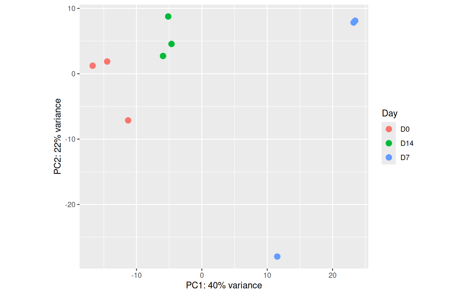
ggsave("PCA_plot.pdf", pcaPlot, device = "pdf")6.2.1 How to interpret the PCA plot
- Each point is one sample. Points close together have similar overall gene expression profiles.
- Good signs: Replicates of the same time point cluster tightly together; different time points separate from each other. This confirms that Day is the dominant source of variation and that the experiment worked.
- Warning signs: An outlier replicate sitting far from its group, or samples clustering by batch/run date rather than by Day — these would need investigation before trusting DGE results.
- Variance explained: The axis labels tell you how much of the total transcriptome-wide variation each PC captures. A high PC1 % (e.g., >50%) with clear group separation is a reassuring sign.
7 Differential Expression Results
7.1 Extract results for each contrast
# contrast = c("variable", "numerator", "denominator")
# Positive fold change = higher in numerator (D7 or D14) relative to denominator (D0)
res_D7_vs_D0  <- results(dds, contrast = c("Day", "D7",  "D0"))
res_D14_vs_D0 <- results(dds, contrast = c("Day", "D14", "D0"))
Each results table contains, for every gene:
| Column | Meaning |
|---|---|
baseMean |
Average normalised count across all samples |
log2FoldChange |
log₂(numerator / denominator) — the effect size |
lfcSE |
Standard error of the log2FC estimate |
stat |
Wald test statistic |
pvalue |
Unadjusted p-value |
padj |
p-value adjusted for multiple testing (Benjamini-Hochberg FDR) |
ImportantAlways use
padj, not pvalue
We test ~16,000 genes simultaneously. By chance, ~5% (800 genes!) would appear significant at p < 0.05 even if nothing were truly changing. padj controls the false discovery rate (FDR) — a padj of 0.05 means we expect 5% of our “significant” hits to be false positives.
summary(res_D7_vs_D0)
out of 15922 with nonzero total read count
adjusted p-value < 0.1
LFC > 0 (up)       : 2839, 18%
LFC < 0 (down)     : 2598, 16%
outliers [1]       : 49, 0.31%
low counts [2]     : 0, 0%
(mean count < 4)
[1] see 'cooksCutoff' argument of ?results
[2] see 'independentFiltering' argument of ?resultssummary(res_D14_vs_D0)
out of 15922 with nonzero total read count
adjusted p-value < 0.1
LFC > 0 (up)       : 554, 3.5%
LFC < 0 (down)     : 146, 0.92%
outliers [1]       : 49, 0.31%
low counts [2]     : 1540, 9.7%
(mean count < 18)
[1] see 'cooksCutoff' argument of ?results
[2] see 'independentFiltering' argument of ?results
7.2 MA Plots
An MA plot visualises the relationship between expression level and fold change for all genes simultaneously.
par(mfrow = c(1, 2))
plotMA(res_D7_vs_D0,  main = "D7 vs D0",  ylim = c(-5, 5))
plotMA(res_D14_vs_D0, main = "D14 vs D0", ylim = c(-5, 5))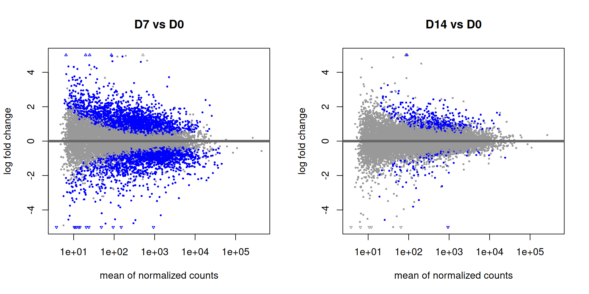
par(mfrow = c(1, 1))7.2.1 How to interpret MA plots
- X-axis (A): Mean expression level — genes on the right are more highly expressed.
- Y-axis (M): log₂ fold change — above 0 means upregulated, below 0 means downregulated.
- Blue/red points: Statistically significant DEGs (padj < 0.1 by default).
- What to look for: The cloud of grey points should be centered around M = 0 (most genes don’t change). If the whole cloud is shifted up or down, there may be a normalisation issue. You’ll notice that low-expression genes (left side) have more scatter — this is expected, since estimates are noisier with fewer counts. DESeq2’s shrinkage estimator pulls extreme fold changes at low counts toward zero.
7.3 Volcano Plots
Volcano plots combine fold change and statistical significance in one view, making it easy to see the most biologically meaningful DEGs.
# Helper function: convert DESeq2 results to a tidy data frame
prep_volcano <- function(res, contrast_label) {
  as.data.frame(res) %>%
    rownames_to_column("gene") %>%
    filter(!is.na(padj)) %>%      # remove genes excluded from testing
    mutate(
      contrast = contrast_label,
      sig = case_when(
        padj < 0.05 & log2FoldChange >  1 ~ "Up",
        padj < 0.05 & log2FoldChange < -1 ~ "Down",
        TRUE ~ "NS"   # Not Significant
      )
    )
}

volcano_data <- bind_rows(
  prep_volcano(res_D7_vs_D0,  "D7 vs D0"),
  prep_volcano(res_D14_vs_D0, "D14 vs D0")
)
volcanoPlot <- ggplot(volcano_data, aes(x = log2FoldChange, y = -log10(padj), color = sig)) +
geom_point(alpha = 0.5, size = 1) +
scale_color_manual(values = c("Up" = "red", "Down" = "blue", "NS" = "grey70")) +
geom_vline(xintercept = c(-1, 1), linetype = "dashed", color = "black") +
geom_hline(yintercept = -log10(0.05), linetype = "dashed", color = "black") +
facet_wrap(~ contrast) +
labs(
x = "log2 Fold Change",
y = "-log10 adjusted p-value",
color = "Direction"
) +
theme_bw()
volcanoPlot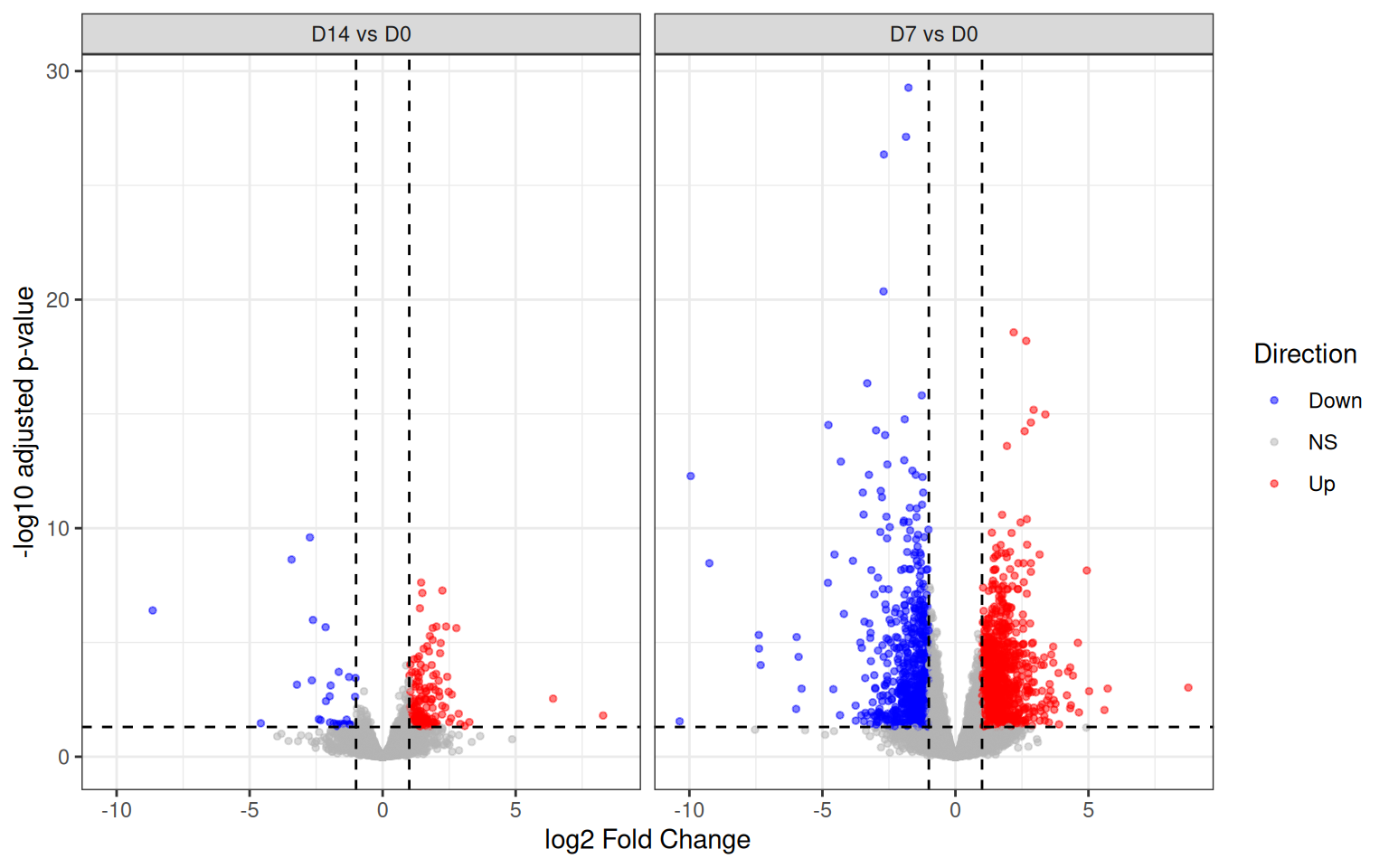
ggsave("Volcano_plot.pdf", volcanoPlot, device = "pdf")7.3.1 How to interpret volcano plots
- X-axis: Effect size. Right = upregulated in the later time point vs D0; left = downregulated.
- Y-axis: Statistical confidence. Higher up = more significant (more negative log of padj).
- Dashed lines: Our significance thresholds. The vertical lines mark |log2FC| = 1 (i.e., a 2-fold change); the horizontal line marks padj = 0.05.
- Coloured points (upper corners): These are our “hits” — genes that are both statistically significant AND biologically meaningful in magnitude. A gene can be statistically significant but have a tiny fold change (meaningful only with enormous sample sizes), or have a large fold change but high variability (not significant). The top corners capture both.
- Comparing panels: More dots in the upper corners for D14 vs D0 than D7 vs D0 suggests the transcriptome changes accumulate over time — a common finding in time-course experiments.
7.4 Heatmap
The heatmap lets us visualise the expression pattern of the top DEGs across all samples at once, and see whether genes cluster into coherent groups (e.g., early-response genes vs late-response genes).
# Pool both contrasts, sort by padj, take the top 50 unique genes
top_genes <- bind_rows(
  as.data.frame(res_D7_vs_D0)  %>% rownames_to_column("gene"),
  as.data.frame(res_D14_vs_D0) %>% rownames_to_column("gene")
) %>%
  filter(!is.na(padj)) %>%
  arrange(padj) %>%
  distinct(gene, .keep_all = TRUE) %>%   # keep each gene only once
  slice_head(n = 50) %>%
  pull(gene)

# Extract VST-normalised counts for those genes
mat        <- assay(vsd)[top_genes, ]

# Z-score each row (gene) so colours reflect relative change, not absolute expression
mat_scaled <- t(scale(t(mat)))

# Column annotations
annotation_col <- data.frame(Day = pheno_data$Day)
rownames(annotation_col) <- rownames(pheno_data)pheatmap(
mat_scaled,
annotation_col = annotation_col,
cluster_rows = TRUE,
cluster_cols = TRUE,
show_rownames = TRUE,
show_colnames = TRUE,
fontsize_row = 7,
main = "Top 50 DEGs (scaled VST counts)"
)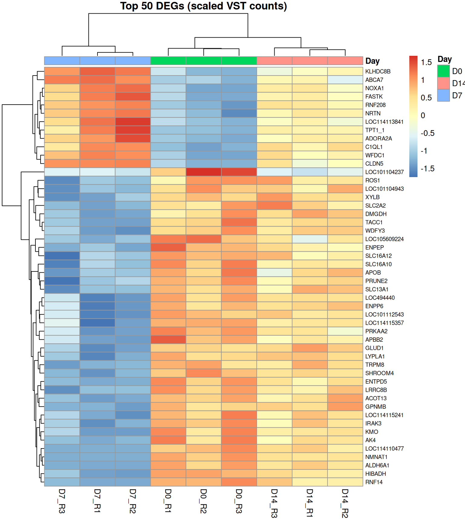
7.4.1 How to interpret the heatmap
- Colour: Each cell’s colour reflects the z-score of that gene in that sample. Blue = below the gene’s mean expression; red = above the gene’s mean. We z-score so that all genes are on the same scale regardless of their absolute expression level.
- Row clustering (genes): Genes with similar expression patterns across samples are grouped together by hierarchical clustering. Look for distinct blocks — e.g., a cluster that goes red at D14 but stays blue at D0 and D7 represents late-induced genes.
- Column clustering (samples): Samples with similar overall expression profiles cluster together. Ideally, replicates of the same Day group next to each other, confirming biological reproducibility.
- Why pool contrasts for top genes? Taking the 50 lowest padj genes from either comparison gives a more complete picture of the biology than looking at one contrast alone — you’ll catch genes that are most changed early (D7) or late (D14).
8 Summary
Here is a brief recap of the full workflow:
Raw count matrix
      │
      ▼
DESeqDataSetFromMatrix()   ← attach metadata & design
      │
      ▼
Filter low-count genes     ← remove noise, reduce multiple testing
      │
      ▼
DESeq()                    ← normalise → estimate dispersion → fit GLM → test
      │
      ├──── vst() → PCA          (QC: do samples separate as expected?)
      │
      ├──── results() → MA plot  (global view of effect size vs expression)
      │
      ├──── results() → Volcano  (which genes are significant AND large change?)
      │
      └──── results() → Heatmap  (patterns across top DEGs and all samples)
8.0.1 Key thresholds used in this analysis
| Threshold | Value | Rationale |
|---|---|---|
| Minimum counts filter | ≥ 10 counts in ≥ 3 samples | Remove unreliably low-count genes |
| Adjusted p-value cutoff | < 0.05 | 5% FDR |
| Fold-change cutoff | |log2FC| > 1 | At least a 2-fold change |
9 Session Info
sessionInfo()R version 4.5.0 (2025-04-11)
Platform: x86_64-pc-linux-gnu
Running under: Ubuntu 24.04.4 LTS
Matrix products: default
BLAS: /usr/lib/x86_64-linux-gnu/openblas-pthread/libblas.so.3
LAPACK: /usr/lib/x86_64-linux-gnu/openblas-pthread/libopenblasp-r0.3.26.so; LAPACK version 3.12.0
locale:
[1] LC_CTYPE=C.UTF-8 LC_NUMERIC=C LC_TIME=C.UTF-8
[4] LC_COLLATE=C.UTF-8 LC_MONETARY=C.UTF-8 LC_MESSAGES=C.UTF-8
[7] LC_PAPER=C.UTF-8 LC_NAME=C LC_ADDRESS=C
[10] LC_TELEPHONE=C LC_MEASUREMENT=C.UTF-8 LC_IDENTIFICATION=C
time zone: UTC
tzcode source: system (glibc)
attached base packages:
[1] stats4 stats graphics grDevices utils datasets methods
[8] base
other attached packages:
[1] pheatmap_1.0.13 lubridate_1.9.5
[3] forcats_1.0.1 stringr_1.6.0
[5] dplyr_1.2.1 purrr_1.2.2
[7] readr_2.2.0 tidyr_1.3.2
[9] tibble_3.3.1 ggplot2_4.0.3
[11] tidyverse_2.0.0 DESeq2_1.50.2
[13] SummarizedExperiment_1.40.0 Biobase_2.70.0
[15] MatrixGenerics_1.22.0 matrixStats_1.5.0
[17] GenomicRanges_1.62.1 Seqinfo_1.0.0
[19] IRanges_2.44.0 S4Vectors_0.48.1
[21] BiocGenerics_0.56.0 generics_0.1.4
loaded via a namespace (and not attached):
[1] gtable_0.3.6 xfun_0.60 lattice_0.22-6
[4] tzdb_0.5.0 vctrs_0.7.3 tools_4.5.0
[7] parallel_4.5.0 pkgconfig_2.0.3 Matrix_1.7-3
[10] RColorBrewer_1.1-3 S7_0.2.2 lifecycle_1.0.5
[13] compiler_4.5.0 farver_2.1.2 textshaping_1.0.5
[16] codetools_0.2-20 htmltools_0.5.9 yaml_2.3.12
[19] pillar_1.11.1 BiocParallel_1.44.0 DelayedArray_0.36.1
[22] abind_1.4-8 tidyselect_1.2.1 locfit_1.5-9.12
[25] digest_0.6.39 stringi_1.8.7 labeling_0.4.3
[28] fastmap_1.2.0 grid_4.5.0 cli_3.6.6
[31] SparseArray_1.10.10 magrittr_2.0.5 S4Arrays_1.10.1
[34] withr_3.0.3 scales_1.4.0 timechange_0.4.0
[37] rmarkdown_2.31 XVector_0.50.0 otel_0.2.0
[40] ragg_1.5.2 hms_1.1.4 evaluate_1.0.5
[43] knitr_1.51 rlang_1.3.0 Rcpp_1.1.2
[46] glue_1.8.1 jsonlite_2.0.0 R6_2.6.1
[49] systemfonts_1.3.2 9.1 Resources
- Bulk RNA-seq: https://academic.oup.com/bib/article/22/6/bbab259/6330938
- Differential expression and RNA-seq data analysis (count modeling): https://hbctraining.github.io/Training-modules/planning_successful_rnaseq/lessons/count_modeling.html
- STAR alignment walkthrough: https://hbctraining.github.io/Intro-to-rnaseq-hpc-O2/lessons/03_alignment.html
- Canine PBMC mammary tumor expression study: https://pmc.ncbi.nlm.nih.gov/articles/PMC12256404/
- Canine leukocyte scRNA-seq (healthy vs. osteosarcoma): https://www.frontiersin.org/journals/immunology/articles/10.3389/fimmu.2023.1162700/full
- Spatial transcriptomics (Rao et al. 2021, Nature): https://www.nature.com/articles/s41586-021-03634-9
- Spatial transcriptomics in tumor heterogeneity: https://www.nature.com/articles/s42003-026-10152-9
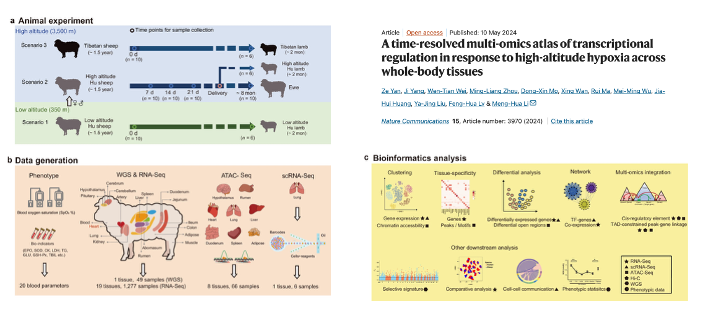
- Example time-course RNA-seq dataset: https://www.nature.com/articles/s41467-024-48261-w
- WGCNA introduction and applications: https://bigomics.ch/blog/introduction-to-wgcna-and-its-applications-in-gene-correlation-network-analysis/
- WGCNA video walkthrough: https://www.youtube.com/watch?v=q9a2RvqYZzQ
- WGCNA examples in the veterinary literature: https://www.mdpi.com/2076-2615/14/10/1470
- Networks in microbial ecology (review): https://journals.asm.org/doi/full/10.1128/mSystems.00124-19
- Networks background video: https://www.youtube.com/watch?v=pYMsI-8GsxI
- Scale-free network background: http://social-dynamics.org/scale-free-network/
- Newman on networks (reference reading): https://drive.google.com/file/d/1vuwIeIfuOCN-xcKxeBnubP0Bg9GQG95z/view?ts=63b49e85
- Nature subjects: ecological networks: https://www.nature.com/subjects/ecological-networks